 Gilles Crofils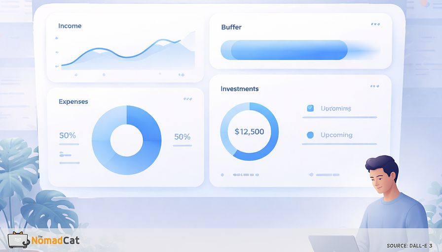
Managing freelance finances shouldn’t feel like solving a puzzle, but for a long time, that’s exactly how it felt for me. I remember sitting in my Berlin flat, juggling apps, spreadsheets, and a flood of notifications. One spring, I actually missed a tax bill because it was buried in a sea of emails and reminders. The stress wasn’t just about the money—it was the constant mental load, the dread of opening yet another finance app, and the urge to avoid money tasks altogether.
I want to share how a simple, unified dashboard changed things for me. I’ll walk through the headaches of scattered finances, why mental clarity matters, and how a minimalist setup brought me peace of mind (and a bit more time for my garden). I’ll include a checklist of what I track, how I picked my platform, and tips for keeping things easy. You’ll see real examples—including my own—of how dashboards help dodge stress and procrastination.
Here’s how I built my dashboard, kept it simple, and found some much-needed reassurance along the way.
Why a unified dashboard matters
Too many tools, too much stress
Picture this: I had three bank accounts, a handful of payment apps, and at least four spreadsheets open at any given time. Notifications beeped, bills got lost, and somewhere, a client’s payment was overdue. It was chaos. Each money task felt like a guessing game, and the risk of missing bills or double charges was real. But the real problem was the constant mental fog.
The real toll of scattered finances
Jumping between apps wore me down. I read somewhere that every extra tool adds to mental clutter, and I felt it. Some weeks, managing money felt like a second job. The stress stole my focus from creative work—writing, coding, even my carpentry side projects. When it got overwhelming, I’d procrastinate, which only made things worse.
Procrastination and avoidance
I used to think I was just lazy about money. But logging into five different apps really does drain motivation. That’s how financial avoidance starts. I’d put off tax prep or budgeting, and those tasks would snowball into bigger headaches. Complicated systems led to more procrastination and less control. I needed a minimalist setup to break the cycle.
Minimalism brings clarity
Minimalism, for me, isn’t just about fewer things—it’s about cutting out the noise to focus on what matters. When I switched to one dashboard that showed only the essentials, I felt a wave of calm. No more hunting for numbers or guessing what was due next. The clutter fell away, and what was left was clear and manageable.
Simple views, smarter moves
With all my financial info in one spot, I could finally spot trends and catch issues early. A simple setup meant I could act fast—send an invoice, save for taxes, or chase a late client. It wasn’t just about doing less; it was about working smarter.
More space for what matters
A minimalist dashboard gave me back time for creative work—and, honestly, more afternoons in the garden. With financial clarity, it felt like having a tidy workshop: less clutter, more focus. Here’s what I learned about what really belongs in a minimalist dashboard.
Dashboard essentials
What to track (and what to skip)
After a lot of trial and error, I settled on tracking just five things:
- Income: All sources—client projects, side gigs, royalties, even the odd P2P lending payment.
- Buffer (runway): How long my savings would last if income stopped.
- Expenses: Split into must-haves (rent, software) and extras (gadgets, streaming).
- Investments: The big picture—total value and allocation, not daily swings.
- Upcoming obligations: What’s due soon—taxes, big renewals.
Here’s a real breakdown from my dashboard last quarter:
- Income: €4,200 (main freelance gig), €600 (side project), €120 (royalties), €80 (P2P lending)
- Buffer: 4.5 months (based on average monthly expenses of €1,100)
- Expenses: €850 (essentials: rent, utilities, software), €250 (extras: new headphones, Netflix, random tools)
- Investments: €9,800 (60% ETFs, 25% cash savings, 15% P2P lending)
- Obligations: €1,200 tax payment due in 3 weeks, €180 software renewal next month
Sticking to these basics keeps my dashboard clear and practical. Let me show you how this plays out, starting with income.
Income tracking makes volatility visible
As a freelancer, my income jumps around. I started tracking every euro—main gigs, weekend jobs, small royalties. Sorting by client and project, I noticed a pattern: spring was always busy (up to €5,000/month), but August dropped to €2,000 or less. Once I saw this, I started setting aside extra savings in the spring to cover the summer slump. It made a huge difference—no more panic in August.
Buffer and runway: calm for rough patches
My buffer chart shows how long I can cover essentials if work dries up. I use three layers: one for rent and bills, one for taxes, and a “just in case” fund. Seeing these together calms my nerves. Watching my buffer grow from 2 months to over 4 months last year gave me real confidence. It’s not just numbers—it’s peace of mind.
Expenses: clarity for quick decisions
Splitting expenses into essentials and extras helps me plan. If income drops, I know exactly what to cut first. When I saw my “extras” balloon one month (thanks, new power tools), it was easy to pause those purchases. I keep categories simple—too much detail just creates confusion.
Skip the bloat
It’s tempting to add every chart—like average coffee spend—but if I’m not using a metric to make decisions, I ditch it. Feature creep happens fast. The leaner the setup, the simpler it is. Now, let’s look at investments and obligations.
Smart visuals for investments and obligations
Simple investment snapshots
I just need a quick overview: total value, recent changes, and how my money is split (ETFs, cash, P2P). Unless you’re managing a fortune, fancy charts just add noise. I want to glance and know, “Is my nest egg growing or shrinking?” That’s enough.
Obligations: reminders that work
Upcoming stuff—taxes, big bills, renewals—gets a clear spot. I use color icons and countdowns so nothing sneaks up. A red icon means a tax deadline’s close; green means a bill’s paid. These cues take pressure off my brain and help me avoid last-minute panics.
Forecasting without overwhelm
My forecasting is simple: a monthly line chart showing if a lean month’s ahead or a big payment is coming. No complex models—just enough info to plan. This keeps stress down and life manageable.
Choose your dashboard tools
My platform pick
I’ve tried Notion, Google Sheets, and open-source dashboards. In Berlin, I started with Google Sheets because it was familiar and flexible. I loved the formulas and charts, but manual entry got old fast. When I moved to Lisbon, I switched to Notion for its clean look and easy customization. It felt like building my own finance HQ—plus, I could add notes and reminders right next to my numbers. The downside? Importing transactions is manual, and privacy isn’t perfect (hello, US servers). For privacy, I tested Firefly III, but the setup was a bit much for my taste. In the end, Notion hit the sweet spot for me: flexible, visual, and just private enough for my needs.
Here’s how I built my system.
Keep setup simple and secure
Gather only what you need
I start with just the basics:
- Export recent bank transactions (CSV or PDF)
- Download or list open invoices and payments
- Summarize current investments or savings
- Skip what I don’t use (old receipts, tiny transfers)
The less I bring in, the neater my dashboard—and the safer my info.
Structure and visualize for clarity
To keep things clear, I:
- Set up tables for income, expenses, and investments
- Add a chart or progress bar for my buffer/runway (so I know at a glance how long my savings last)
- Use colors: green for good, yellow for caution, red for urgent
- Flag what needs attention with icons (like a red dot for overdue invoices)
- Keep categories broad—no more than 5-6 per section
This way, I spot problems without wading through endless rows.
Automate only what helps
Automation is great—if it saves time. I tried linking my bank to Notion with Zapier, but it was more hassle than help. Now, I update things manually once a month. It takes 15 minutes and feels safer. I automate only the boring stuff (like recurring expenses), but keep the system simple enough that I’m not stuck fixing it.
Prune and refresh on a schedule
Dashboards get messy fast. Categories pile up, old data lingers, and suddenly it’s chaos again. I set a review every three months:
- Prune unused parts
- Archive old data
- Cut categories that don’t add value
- Check security settings
This routine keeps my dashboard lean and relevant. It’s a bit like weeding the garden—tedious, but worth it.
Dashboards in action
My minimalist dashboard story
When I moved from Berlin to Lisbon, my freelance income became even more unpredictable. I built a Notion dashboard with just five modules: income, buffer, expenses, investments, and obligations. One month, a client delayed payment by six weeks. Instead of panicking, I checked my buffer chart—still good for three months. I paused extra expenses, chased the invoice, and didn’t lose sleep. The dashboard turned what could have been a crisis into a minor hiccup.
Other real-world examples
A developer friend in Berlin uses Notion to track income bursts and budget for big buys. With a simple buffer chart, he knows if buying a new laptop makes sense or if waiting is smarter. In Lisbon, a product manager I know uses Google Sheets to watch different income flows. When a client slacks on payments, her dashboard makes it obvious. She tweaks investments or cuts extras until things smooth out.
Wireframes from my design days show why minimalist dashboards shine. Whitespace keeps things clear, colors and icons point out what’s urgent—like a red dot for late invoices or a green bar for healthy savings. No clutter, just clarity.
Lessons learned
The dashboards that work aren’t the fanciest—they’re the ones I actually open and update. Too many features, and I give up. Simplicity and steady habits beat flashy extras every time. What matters: a quick snapshot, easy visuals, and the chance to tweak things as jobs change. The best dashboards stay focused and simple.
Make dashboards drive action
Smart alerts and visual cues
Visual cues help a lot. My dashboard nudges me at the right moment—a red buffer bar when money’s tight, a soft reminder about an upcoming bill. Too many alerts and I ignore them all, so I only flag what’s truly important. Colors, icons, and progress bars make life easier. A yellow bar means a lean month; a green check by “taxes paid” offers quick relief.
I prefer email reminders, but some friends like phone pings. Letting people choose keeps things user-friendly and avoids notification overload.
Templates for review and action
A monthly review template keeps everything running:
- What’s new since last month?
- What needs action?
- Any late invoices or overdue bills?
- Is the buffer still okay?
Quarterly, I prune the dashboard:
- Archive old info
- Merge overlap
- Remove unused stuff
- Review security
Each review is a good time to tweak goals—maybe boost the buffer, start a new gig, or cut excess expenses. This way, the dashboard stays alive, not stuck.
Keep it minimalist
Avoiding feature creep
It’s tempting to keep adding widgets, charts, or extra connections—especially if you love fiddling with tech (guilty as charged). But every new feature means more maintenance, and too many just pile on the stress. The dashboard’s aim is clarity, not chaos. I ask myself: does this feature help me act or bring peace of mind? If not, I skip it.
A trick I use: I show my dashboard to a friend. If they can’t find an important number in five seconds, something needs cutting. Even informal feedback sharpens things.
Routine reviews keep things sharp
Every quarter, I:
- Archive old accounts or categories
- Merge duplicates
- Delete unused charts and widgets
- Check connected apps for relevance
- Review security permissions
Less data means less to protect. As my work changes, so does my dashboard. Add a new income stream, close an old client—keep it frictionless. Reviews help me tweak, simplify, and adapt the dashboard so it always fits just right. Handy templates online make regular reviews easy (I grabbed one from Notion’s template gallery and tweaked it for my needs).
Resources and next steps
Templates and tools I use
Getting started doesn’t mean starting from scratch. I used Notion’s “Freelance Finance Tracker” template as a base, then stripped out half the widgets. For Google Sheets, the “Simple Budget” template worked well before I switched. Open-source tools like Firefly III are great if you want privacy and control, but be ready for a bit more setup.
Communities help too. I lurk on r/SimpleLiving and Bogleheads for advice, checklists, and real-world feedback. Seeing how others organize their dashboards—through demos, screenshots, or stories—always gives me new ideas (and a laugh at some of the wild color schemes out there).
A minimalist dashboard made freelance finance less messy—and, dare I say, a little fun. By sticking to the essentials—income, buffer, expenses, investments, and obligations—I found more clarity and less stress. The biggest win? More mental space for creative work, problem-solving, and yes, more time in the garden. Whether you use Notion, Sheets, or an open-source tool, the trick is to keep things lean, review often, and skip the clutter. For me, streamlining isn’t just about neatness. It’s about building a system that moves with you as your freelance life shifts. Sometimes, a little less really does bring a lot more.


